Learning to operate the contrast is the skill every interior designer has to master sooner or later. Check how to use it thoughtfully when selecting colours, fabrics, and furniture.
Can you recall being inside interiors that look polished to the smallest detail but still seem flat and bland? The problem was probably originating from the lack of contrast. Using it thoughtfully enables creating interiors that feel complete and captivating.
In this article, we will introduce you to the basics of operating the contrast in interior design. Our tips may be helpful for non-professionals who want to improve the decor without carrying out a general overhaul. Sometimes, it is enough to introduce one contrasting colour or texture to change the ambiance radically.
Put contrasting colors together
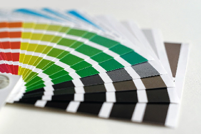
When talking about contrasts, colour is the first thing that comes to mind. And indeed - combining some contrasting ones can bring an astonishing result. It is particularly important in the case of patterns that can easily blur when the colours are too similar.
It is not only about brightness or the extreme differences like the one between black and white. Contrast also originates from putting together the opposite shades of the colour palette. Examples? Turquoise and orange, lime and Fuchsia, dark yellow and navy blue - all these pairs make fantastic combinations since they face each other on the colour wheel.
The method that facilitates achieving a visual harmony is a complementary colour scheme. That means using two or three complementary shades from the opposite ends of the colour wheel. If you limit yourself to two colours only, the effect might seem a little too bold. Adding some other shades can soften it.
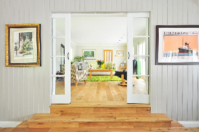
Mix various materials
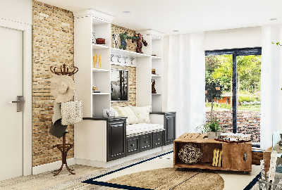
The colours come to mind right away, but you can also use contrast in some other ways - for example, by combining different materials. That refers to fabrics, upholstery, wall decor, floors, furniture, and other aspects of interior design. Overusing one material can result in a monotonous and overwhelming effect. That refers particularly to wood which can create a rustic look if used in excess. Adding some stone or concrete can highlight the beauty of wooden accessories.
Mixing materials does not necessarily have to end up with an eclectic interior design. You can try a similar method to the one we advised for colours. Choose two dominant materials - like wood and stone, for example - and differentiate their shades to achieve a stunning effect.
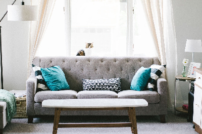
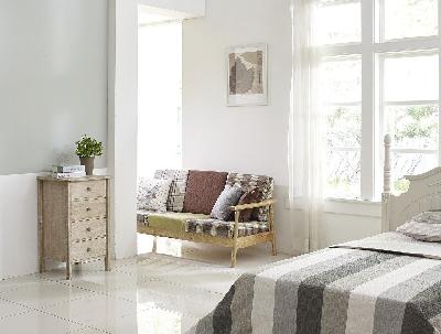
Combine various textures
The same material with various textures? That will also add another dimension to your interiors. Let's take, for example, smooth, polished oak wood. It is beautiful and versatile but will look incomparably better if combined with untreated solid wood with a much darker shade. This kind of contrast makes the particular elements of the design more eye-catching and contributes to its character.
The easiest way to combine contrasting textures is mixing rough with smooth - just as in the case of the two types of wood mentioned above. Another methodology to adopt is blending shiny with matte.
Mix shapes
Who said that you should stick to sharp edges and straight angles? You can introduce the contrast to the shapes of your furniture and accessories as well! You will be surprised how much difference does it make.
Combine patterns
This one is tricky - because patterns are not easy to put together without an exaggerated effect. But it is possible! The secret is to find some common element - for example, the colour scheme. It does not have to be exactly the same, but similar at least. Another rule worth sticking to is diversifying the sizes. Patterns will not ever look good together if they have the same size.
The best way is to combine small, simple patterns with the big and complex ones in similar shades. Mixing patterns can result in visually stunning interiors with a boho touch.
Using all these tips, you can compose a stunning design that catches the eye immediately but remains harmonic and classy. Or you can rather leave it to the decorating company in London that will incorporate all the principles listed above in their arrangement. Contact us if you are interested in the professional support.